

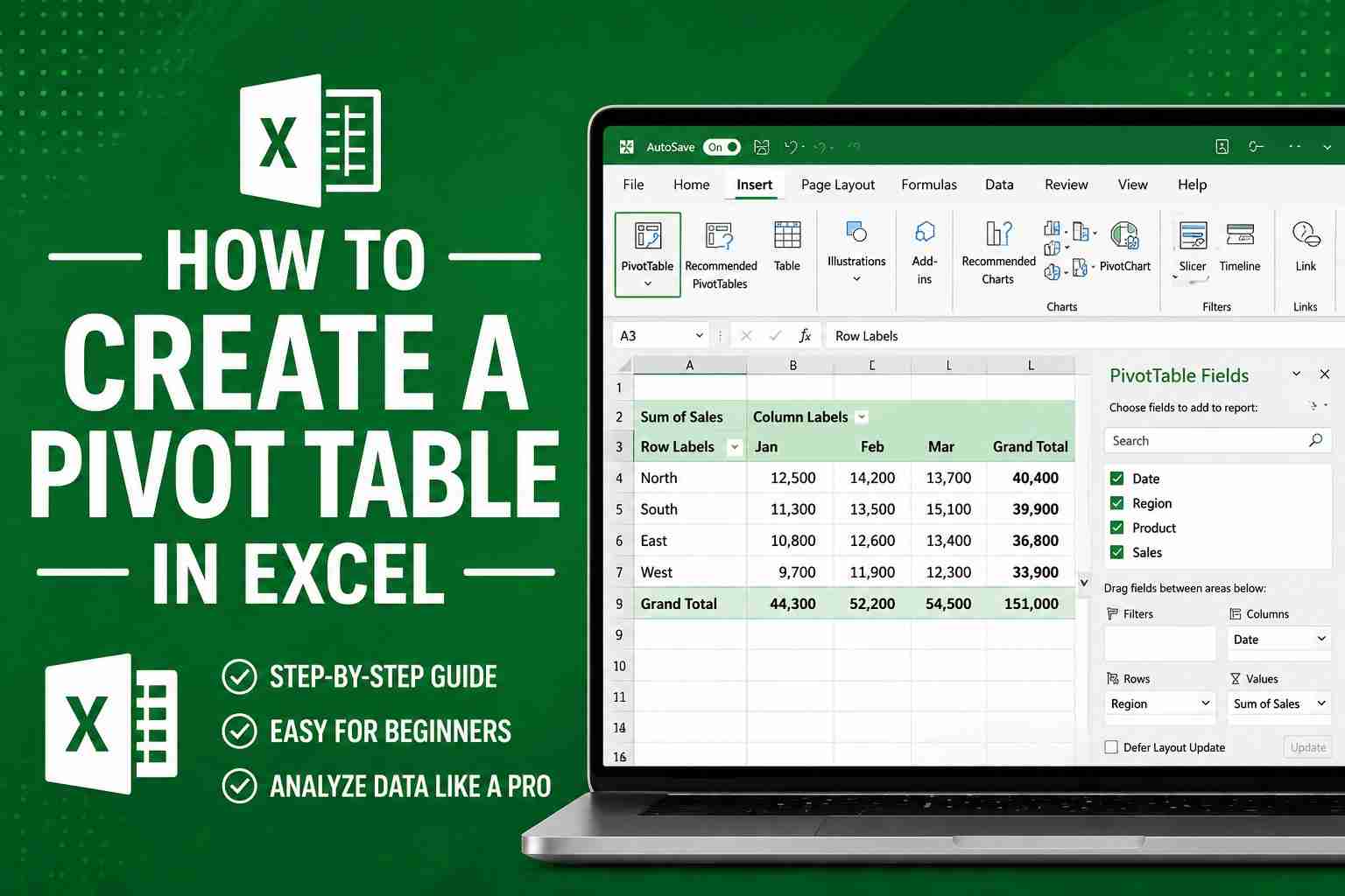
Let’s Be Real for a Second
You’ve got an Excel sheet open. It’s huge. You’re scrolling. Your eyes are glazing over. And somewhere in the back of your mind, you’re thinking, “There’s no way I’m going through all this manually.”
I’ve been there. More times than I’d like to admit.
The first time someone showed me a pivot table, I literally said, “Wait… that’s it?” It felt like cheating. A few clicks, and suddenly all that messy data turned into something I could actually make sense of.
If you’ve never used one before, don’t worry. I’ll walk you through it like we’re sitting next to each other.
So… What Even Is a Pivot Table?
Honestly? It’s just a tool that helps you stop staring at rows of numbers and start understanding them.
With a pivot table, you can:
- Add stuff up
- Find averages
- Group things together
- Spot patterns you’d never notice otherwise
And the best part? No formulas. No headaches. You just drag and drop, and Excel does the rest.
Want to see total sales by month? Done.
Break down expenses by category? Easy.
Analyse student marks by subject? Takes seconds.
Oh, and it’s called a “pivot” table because you can literally pivot—turn the data around—whenever you want to look at it differently.
One Thing Before You Start (Seriously, Do This)
I learned this the hard way, so let me save you the trouble.
Before you create a pivot table, take a quick look at your data:
- Make sure every column has a heading (no blanks—Excel gets confused)
- No empty rows hiding in the middle
- Each column has one type of data (don’t mix numbers and text)
- No merged cells (they cause chaos)
Also, check that your numbers are actually numbers and your dates are dates. Excel can be picky.
Here’s a trick I always use:
Hit Ctrl + T to turn your data into a table. It sounds small, but it makes everything smoother—especially when you add more data later.
How to create a pivot table in Excel step by step
Ready? This is easier than you think.
Step 1: Click Anywhere in Your Data
You don’t need to highlight everything. Just click inside the dataset somewhere.
Step 2: Go to Insert → PivotTable
Up at the top, click Insert, then PivotTable.
Step 3: Pick a Spot
A little box pops up. Excel already knows your data range. Just choose New Worksheet (it keeps things tidy) and hit OK.
Step 4: Don’t Freak Out at the Blank Screen
You’ll see a blank grid on the left and a panel on the right. That panel is where all the magic happens.
Step 5: Drag and Drop (This Is the Fun Part)
You’ll see four boxes:
- Rows → things you want listed (like product names or regions)
- Columns → how you want to compare (like months or years)
- Values → the numbers you want to calculate (like sales or counts)
- Filters → optional filters if you want to narrow things down
Just drag fields into those boxes and watch Excel build your report instantly. It feels almost too easy.
Step 6: You’re Done
Seriously. That’s it.
Now go ahead—move things around, remove stuff, try different combinations. You won’t break anything. I promise.
How to Make It Actually Useful
A basic pivot table is great. But a few small tweaks can make it feel like magic.
Change What You’re Calculating
By default, Excel sums things up. But what if you want an average instead?
Right-click any number → Value Field Settings → pick Average, Count, or whatever you need.
Filter Without Messing Around
Want to see just one region or one product? Use the dropdowns on the table.
Or go a step further…
Use Slicers (They’re Awesome)
Go to PivotTable Analyse → Insert Slicer. You’ll get clickable buttons that filter your data. It’s clean, visual, and honestly makes you look like an Excel pro.
Sort So You Actually See What Matters
Click the dropdown on your row labels and sort from largest to smallest. That way, you spot the big stuff first.
Refresh When Your Data Changes
This one trips everyone up at first.
If you update your original data, your pivot table doesn’t update automatically. Just right-click it and hit Refresh. That’s it.
Want a Chart? Add a Pivot Chart
Sometimes numbers alone don’t tell the full story.
Click your pivot table → PivotTable Analyse → PivotChart → pick a chart type.
Done. And the best part? The chart updates whenever your pivot table changes. No extra work.
Mistakes I’ve Made (So You Don’t Have To)
Let me save you some frustration:
- Blank headers → Excel throws a fit. Just don’t.
- Numbers stored as text → your calculations won’t work. Check formatting.
- Forgetting to refresh → you’ll wonder why your numbers look old. Refresh!
- New rows not included → if you add data, your pivot table won’t see it unless you converted to a table first (Ctrl + T fixes this).
A Few Things I Wish Someone Told Me Earlier
Once you start using pivot tables, these little things make a big difference:
- Use slicers for filtering. They’re not just useful—they’re actually nice to look at.
- Group dates by month or year with a right-click. So handy.
- Duplicate your pivot table to try different views without messing up your original one.
- Use conditional formatting to highlight big numbers automatically.
- Keep your original data clean. Future you will be grateful.
Alright, Here’s the Truth
If you’ve followed along, you’ve already done the hardest part—getting started.
Pivot tables look intimidating. I get it. But once you try them, you’ll realize they’re actually one of the easiest tools in Excel. And more importantly, they save you so much time.
Next time you’re staring at a huge dataset, don’t torture yourself trying to do it manually.
Just create a pivot table.
You’ll have your answer in seconds. And you’ll wonder why you didn’t try it sooner.
FAQs
What is a pivot table?
It’s a tool that helps you summarize and understand big sets of data without using formulas.
How do I make one as a beginner?
Click your data → Insert → PivotTable → drag fields into Rows, Columns, and Values. That’s literally it.
Does it update when my data changes?
Only if you right-click and hit Refresh. Easy.
What’s the difference between a pivot table and a normal table?
A normal table just shows your data. A pivot table actually helps you make sense of it.
Can I make a chart from it?
Yes, and it’s called a PivotChart. It updates automatically when your pivot table changes